Friday 15 November 2013

Message and Delivery: Research


To start looking at the language already discovered and interpreted by the Yanomami tribe was my first point of call, I wanted to get to know the first few key words to understand the language a bit better. 


These are a few extracts from a book I read online, it was my most useful source for understanding from someones personal point of view, the way of life and how people functioned in a daily routine in the Rainforest. I had my own preconceptions of what I expected them to live and act like so I was surprised to find out they weren't quite what we expected. This book was written from a personal point of view so to hear someone else's opinions was informative and useful.


http://worldwildlife.org/threats/deforestation
http://environment.nationalgeographic.co.uk/environment/global-warming/deforestation-overview/
http://www.theguardian.com/environment/2013/nov/15/deforestation-amazon-jungle-rising-again
http://www.botany.uwc.ac.za/envfacts/facts/deforestation.htm

These are the four main sites that I used for my research, each gave thorough statistics and helped inform me of what the current situation was for the Amazon Rainforest and what the future of it would be. 

Message and Delivery: Delivery


As far as 'high impact' goes I felt that the design of this campaign was really well presented, its loud and clear and I don't think it would be offensive but maybe controversial. The combination of minimal colours and forceful text creates a simple yet hard hitting poster, the use of the explicit language demonstrates the anger and seriousness of the message, but then it also seems to contradict itself as I feel some people may see this as humorous. I think that layering a simple image behind the text creates a good layout, it combines the two and shows the relation.


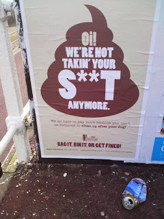
In context out in public I think this maybe could be seen in a different light, to young children it is too explicit, I think the parents would be concerned and offended. Having said that to the correct audience, dog walkers, it gets the message across strongly, I think it will make them feel guilty also. 'BAG IT. BIN IT. OR GET FINED.' This tagline is simple and factual, it states what is necessary and there is little amount of text so as not to be a tedious, long piece of information.


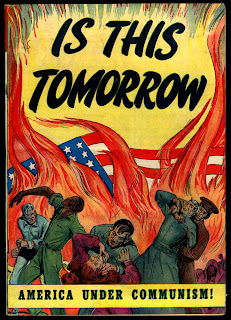
Propaganda posters from around the time of both world war one and world war two is particularly relevant to my research, they all convey a hugely strong message in a high impact design. Rather than a question of 'Is this tomorrow?' It is presented as a statement, it creates a horrifying message and is designed to shock and scare the audience. The use of fire symbolises danger, death and hell, all these negative connotations work well the serious tag line below to create a warning image that is high impact.


Michael Wied

This project is less hard hitting and more informal, I like the simple graphic images that relate to the subject of deforestation however I feel like the designer almost tip toes around the subject. He presents the facts in a neat, long paragraph that I feel draws away from the specific details, it doesn't really shock the audience but it seems to just inform them, this could be perceived as quite boring. The colours don't necessarily relate to the rainforest either, they have connotations of summer and the beach when put together. 


Experimental Jetset - Fur Free Fashion

The minimalism aspect of this piece is something which I think works particularly well regarding creating something that is to the point, factual and shocking. The words all have negative connotations and have been chosen to have this certain effect on the audience. There is little detail about what the project is about but I think it is self explanatory from the words, this is something I aim to display on my posters as it shouldn't be a design that should have to e explained. I think the use of the ampersand is unnecessary and could be removed and allow the poster to still speak for itself.


Experimental Jetset - Wearing Badges

Using objects that are interactive and fun such as badges and stickers is a good idea in terms of getting younger people involved. Relating to several audiences can spread the message much quicker and can get the message across much better and more efficiently. The simplicity of these makes the message clear, however it also makes me want to find out more about what is behind these, creating a message that draws in and intrigues the audience. 

Tuesday 12 November 2013

Alphabet Soup - Typeface (3)

1960's Moviestars


As I knew very little about 1960s fashion I felt I needed to inform myself more about the specific traits and popular trends. From this general extract of information I took some specific words regarding to fashion and investigated further into them.


What has interested me most and what I think will be the most useful in this task is the shape of the bell-bottom trousers and how this could be manipulated or reflected in my work. 


I researched some background knowledge into Audrey Hepburn as she was one of the famous 60s movie stars and someone that Taylor admires. I looked at many images and clips of her and came up with a few connotations of what her personality seemed to reflect.

- elegance
- beauty
- sophistication
- grace
- expense
- sharp natured
- feminine
- confident
- outspoken

A few of these seem to contradict each other, this could also become part of my design perhaps relating to contrasting line weights, not only does this display traits of Audrey Hepburn but as I have already clarified Taylor also has opposite characteristics.


Alton Kelley 
Grateful dead were an American rock band from the 60s, mainly famous for their cover with Bob Dylan of 'knockin' on heavens door'. These posters were created by designer ALton Kelley in the 60s and the typography used was what particularly drew me in. Looking at other typefaces used in the 60s to see how they conveyed the time period was what I found useful, how they represented the easy going laid back lifestyle. The words never seemed to flow in a straight line but as though on a wave of curves or circles, this to me shows the movement of the time and how things were changing with no real structure. I took particular interest in the serifs used here, they are extravagant and large, they don't seem to be following a grid just being put in to compliment the rest of the letterforms structure. 


Other types of design were also important for me to look at, a wide spectrum of the 60s is what I was aiming to gather from a wide breadth of research. This is a company logo design for Dorey Design, a Portland based web design company, is what I found in the Graphis Annual of 67-68 designed by Jeremy Knight and felt it fit in appropriately with my research. The use of circles to create the letter was what caught my attention, the basis of each letter is a perfect circle of which the stem revolves around. I think the way the two circles are the eye catching part is useful, its not necessarily readable but I think that is because there is limited letter forms and it appears to be slanted on a large degree.


Gerald Holtom created the peace sign just before the 60s in 1958, this has become a lrage part of my research and I think will also play a big part in the development of my typeface. The initial sketches by designer Eric Austin are the ones that I prefer the most, the way the three lines crossing through the circle flare slightly before intercepting the outer ring links in really well to my idea of incorporating fashion into the circle like typeface. As my partner declared that the thing that makes her the most unhappy is watching or listening to the news I felt that this is extremely relative to show how she wants peace and happiness and doesn't like to hear of all the unfortunate events taking place around the world on a daily basis, it represents her kind and caring side. 


Sunday 10 November 2013

Alphabet Soup - Illustrator (2)


Sinem Erkas

One of the main things I think of in relation to dimension is lines, accuracy and results, this typeface has such a contrast in line weight, I think that this is something I will experiment with as it links with my partners personality. The extra lines within the shape seem to give it more depth, it creates a heavier letterform which is then balanced out with extra light serifs and other characteristics. I think the extra lines in grey should be incorporated into all of the letters to see how that would look, some feel a bit separate and inconsistent.


Sinem Erkas

A second piece by the same designer Erkas was one that could also be linked to dimension or even just the unique use of lines in general. Its the continuity of the line in each letterform and how it has been constructed that works really well, the basic outline of a sans serif typeface has been used as apposed to a complex serif typeface, that would have made it too difficult I think. I like how some of the letters aren't fully completed as far as whole sides missing yet they are still perfectly clear and readable, whether this is just because they are in context of a sentence maybe.


Samuel Carter Mensah

This version of the typeface Helvetica has a fun and playful intention, it is based solely on the designers love of candy and the typeface itself. I think it focus's mainly at a younger audience with its tone being light hearted and bright, it reminds me of summer.


Samuel Carter Mensah

This is a second typeface developed by Samuel Carter Mensah, I am really surprised at how unique each letterform is considering how readable it is in context. I thought it might be complicated to read when I first saw the individual letterforms but it works well in context but only in large form I think. Because of how complex the type is I think it would only work with two colours and not with any image, I think this would make the page too busy and lose focus.

Monday 4 November 2013

CoP 29/10/13 Semiotic Analysis


This propaganda poster was created during world war one with the obvious purpose to get men of that time to join the army if they hadn't already been convinced to do so. I aim to explore the signs, depth and relations with this complex image and to decipher its' main components and the meanings behind them.
Red, blue and white are an obvious connotation of the United States of America, they demonstrate the flag colours, but by wearing these colours this shows that Uncle Sam, a national personification, is very patriotic. This is regarded as a common acknowledgement or a social agreement considering that he is the representative of the country, and is the signifier that then in turn demonstrates the signified approach that he is top of the hierarchy, an important person. 
The portrait of Uncle Sam is a visual icon, he is portrayed through the perspective of the artist, his stance resembles that of a stern teacher or parent ready to scold a child. His scowling expression is one of the key index's here, it shows displeasure and concern, this has an affect on the audience and makes them feel belittled and childish. 
Words are symbolic in the short paragraph of text, albeit short it is a powerful and quite ruthless passage, the word 'I' is used, this is symbolic as it is personal and direct and shows how all of the power is held by this man asking the question. 'Expect' demonstrates symbolically that this is not a question but a statement or an order, it is to the point and and forceful with the expected result as a command that is followed by all whom it concerns. 
This entire image is made up of signs but several were more obvious initially, he stance and angry facial expression is a key signifier and immediately sets the tone, it signified a serious matter with not a slight bit of humour incorporated. 'I am telling you' is a very forward signifier, it shows an informative tone but in an aggressive and strong manor, it is a surprising choice of words and makes the audience feel small and as if they are in the wrong, a sense of guilt is what is being conveyed. 
The codes of propaganda posters are anything but subtle, there are several common themes that seem to occur in many, including this example in particular. The aim of them is to convince, sell or guilt trip people, in this case it is men that have not yet joined the forces, this is done through the arrangement of words, the tone they create and the impact they have. Large, bold text to emphasise the point they are trying to get across and usually a guilty tone to make that person feel uncomfortable and pointed out.