Showing posts with label OUGD403. Show all posts

Friday, 15 November 2013

Message and Delivery: Research


To start looking at the language already discovered and interpreted by the Yanomami tribe was my first point of call, I wanted to get to know the first few key words to understand the language a bit better. 


These are a few extracts from a book I read online, it was my most useful source for understanding from someones personal point of view, the way of life and how people functioned in a daily routine in the Rainforest. I had my own preconceptions of what I expected them to live and act like so I was surprised to find out they weren't quite what we expected. This book was written from a personal point of view so to hear someone else's opinions was informative and useful.


http://worldwildlife.org/threats/deforestation
http://environment.nationalgeographic.co.uk/environment/global-warming/deforestation-overview/
http://www.theguardian.com/environment/2013/nov/15/deforestation-amazon-jungle-rising-again
http://www.botany.uwc.ac.za/envfacts/facts/deforestation.htm

These are the four main sites that I used for my research, each gave thorough statistics and helped inform me of what the current situation was for the Amazon Rainforest and what the future of it would be. 

Message and Delivery: Delivery


As far as 'high impact' goes I felt that the design of this campaign was really well presented, its loud and clear and I don't think it would be offensive but maybe controversial. The combination of minimal colours and forceful text creates a simple yet hard hitting poster, the use of the explicit language demonstrates the anger and seriousness of the message, but then it also seems to contradict itself as I feel some people may see this as humorous. I think that layering a simple image behind the text creates a good layout, it combines the two and shows the relation.
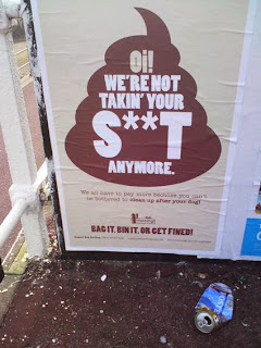

In context out in public I think this maybe could be seen in a different light, to young children it is too explicit, I think the parents would be concerned and offended. Having said that to the correct audience, dog walkers, it gets the message across strongly, I think it will make them feel guilty also. 'BAG IT. BIN IT. OR GET FINED.' This tagline is simple and factual, it states what is necessary and there is little amount of text so as not to be a tedious, long piece of information.
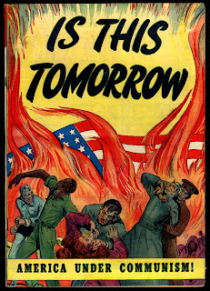
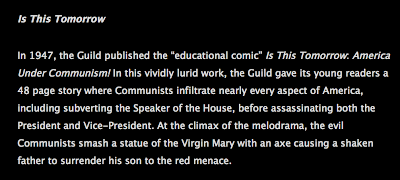

Propaganda posters from around the time of both world war one and world war two is particularly relevant to my research, they all convey a hugely strong message in a high impact design. Rather than a question of 'Is this tomorrow?' It is presented as a statement, it creates a horrifying message and is designed to shock and scare the audience. The use of fire symbolises danger, death and hell, all these negative connotations work well the serious tag line below to create a warning image that is high impact.


Michael Wied

This project is less hard hitting and more informal, I like the simple graphic images that relate to the subject of deforestation however I feel like the designer almost tip toes around the subject. He presents the facts in a neat, long paragraph that I feel draws away from the specific details, it doesn't really shock the audience but it seems to just inform them, this could be perceived as quite boring. The colours don't necessarily relate to the rainforest either, they have connotations of summer and the beach when put together. 


Experimental Jetset - Fur Free Fashion

The minimalism aspect of this piece is something which I think works particularly well regarding creating something that is to the point, factual and shocking. The words all have negative connotations and have been chosen to have this certain effect on the audience. There is little detail about what the project is about but I think it is self explanatory from the words, this is something I aim to display on my posters as it shouldn't be a design that should have to e explained. I think the use of the ampersand is unnecessary and could be removed and allow the poster to still speak for itself.


Experimental Jetset - Wearing Badges

Using objects that are interactive and fun such as badges and stickers is a good idea in terms of getting younger people involved. Relating to several audiences can spread the message much quicker and can get the message across much better and more efficiently. The simplicity of these makes the message clear, however it also makes me want to find out more about what is behind these, creating a message that draws in and intrigues the audience. 

Tuesday, 12 November 2013

Alphabet Soup - Typeface (3)

1960's Moviestars


As I knew very little about 1960s fashion I felt I needed to inform myself more about the specific traits and popular trends. From this general extract of information I took some specific words regarding to fashion and investigated further into them.


What has interested me most and what I think will be the most useful in this task is the shape of the bell-bottom trousers and how this could be manipulated or reflected in my work. 


I researched some background knowledge into Audrey Hepburn as she was one of the famous 60s movie stars and someone that Taylor admires. I looked at many images and clips of her and came up with a few connotations of what her personality seemed to reflect.

- elegance
- beauty
- sophistication
- grace
- expense
- sharp natured
- feminine
- confident
- outspoken

A few of these seem to contradict each other, this could also become part of my design perhaps relating to contrasting line weights, not only does this display traits of Audrey Hepburn but as I have already clarified Taylor also has opposite characteristics.


Alton Kelley 
Grateful dead were an American rock band from the 60s, mainly famous for their cover with Bob Dylan of 'knockin' on heavens door'. These posters were created by designer ALton Kelley in the 60s and the typography used was what particularly drew me in. Looking at other typefaces used in the 60s to see how they conveyed the time period was what I found useful, how they represented the easy going laid back lifestyle. The words never seemed to flow in a straight line but as though on a wave of curves or circles, this to me shows the movement of the time and how things were changing with no real structure. I took particular interest in the serifs used here, they are extravagant and large, they don't seem to be following a grid just being put in to compliment the rest of the letterforms structure. 


Other types of design were also important for me to look at, a wide spectrum of the 60s is what I was aiming to gather from a wide breadth of research. This is a company logo design for Dorey Design, a Portland based web design company, is what I found in the Graphis Annual of 67-68 designed by Jeremy Knight and felt it fit in appropriately with my research. The use of circles to create the letter was what caught my attention, the basis of each letter is a perfect circle of which the stem revolves around. I think the way the two circles are the eye catching part is useful, its not necessarily readable but I think that is because there is limited letter forms and it appears to be slanted on a large degree.


Gerald Holtom created the peace sign just before the 60s in 1958, this has become a lrage part of my research and I think will also play a big part in the development of my typeface. The initial sketches by designer Eric Austin are the ones that I prefer the most, the way the three lines crossing through the circle flare slightly before intercepting the outer ring links in really well to my idea of incorporating fashion into the circle like typeface. As my partner declared that the thing that makes her the most unhappy is watching or listening to the news I felt that this is extremely relative to show how she wants peace and happiness and doesn't like to hear of all the unfortunate events taking place around the world on a daily basis, it represents her kind and caring side. 


Sunday, 10 November 2013

Alphabet Soup - Illustrator (2)


Sinem Erkas

One of the main things I think of in relation to dimension is lines, accuracy and results, this typeface has such a contrast in line weight, I think that this is something I will experiment with as it links with my partners personality. The extra lines within the shape seem to give it more depth, it creates a heavier letterform which is then balanced out with extra light serifs and other characteristics. I think the extra lines in grey should be incorporated into all of the letters to see how that would look, some feel a bit separate and inconsistent.


Sinem Erkas

A second piece by the same designer Erkas was one that could also be linked to dimension or even just the unique use of lines in general. Its the continuity of the line in each letterform and how it has been constructed that works really well, the basic outline of a sans serif typeface has been used as apposed to a complex serif typeface, that would have made it too difficult I think. I like how some of the letters aren't fully completed as far as whole sides missing yet they are still perfectly clear and readable, whether this is just because they are in context of a sentence maybe.


Samuel Carter Mensah

This version of the typeface Helvetica has a fun and playful intention, it is based solely on the designers love of candy and the typeface itself. I think it focus's mainly at a younger audience with its tone being light hearted and bright, it reminds me of summer.


Samuel Carter Mensah

This is a second typeface developed by Samuel Carter Mensah, I am really surprised at how unique each letterform is considering how readable it is in context. I thought it might be complicated to read when I first saw the individual letterforms but it works well in context but only in large form I think. Because of how complex the type is I think it would only work with two colours and not with any image, I think this would make the page too busy and lose focus.

Tuesday, 22 October 2013

Alphabet Soup (1)


I decided that it would be a good idea to watch 'Helvetica' - the documentary by Hustwit so that I felt I knew about Helvetica, its origin and how it became what it is today. I really enjoyed the film, I was surprised by how much it kept me engaged as my preconception would be that my attention span wouldn't last the whole 80 minutes.

I felt much more inspired after watching the movie and constantly took notes on what I thought were key comments or facts throughout the film. Something that I picked up on that I found particularly surprising was the amount of contrasting feelings about this typeface, some designers that thought the world of Helvetica and then there were those who despised it. From the opinion that it can influence the audience with its rhythm and simplicity it is deeply contrasted to being described as predictable, dull and overused. I feel like understand both sides to the argument but I don't feel like I have had enough experience to judge yet. There were a lot of inspirational quotes from many of the designers throughout this film, all which I felt applied to me and my work, 'just because something is legible, doesn't mean it communicates.' I love this phrase by David Carson and it will be one that I remember and take into consideration when creating work.

How did W.W.II have an impact on graphic design?

100 Ideas That Changed Graphic Design
 'It felt like the dawn of a new age.' I think it is safe to say that the ending of the war brought to us the beginning of a new graphic design era, one that was so different no one expected it, but just embraced it, sans serif fonts became very popular and using the grid system became the norm.
100 Ideas That Changed Graphic Design
From the research that I have done I feel like graphic design became more widely recognised and came into its own within this era, it began to reach out to more people than ever in more ways of communicating than before the war. Even the younger generation as I found out were engaged via interactive magazines that reached out to them, this gives a communal feel and makes me feel as though the spirit of coming together as a country was enforced much more at this stage. Now that I have informed myself a lot more about Helvetica and the history of it and its era I feel that I am well prepared to begin this project with valuable information and necessary facts.


I went to vernon street and loaned Geometry of  Type out of the library after the session just so I could go over what I had learnt and revise the definitions. I found the book really useful, it was very clear with minimal text which made it easy to read.


Alvin Mendosa
The fragmentation of this type has the connotations of something broken that once was whole, this is what I aim to reproduce in my body of work for this piece. I want to create something that looks out of place or uncomfortable.


Neville Brody

Friday 11th October - Interim Crit

The crit for me was really helpful, I felt as though I'd hit a bit of a standstill with ideas but immediately the group gave me new and interesting ways to take my letterforms forward.
- use pins and cotton
- Red and blue, create the 3D effect
- Look at lace making
- Photocopy, test out 3D
- Look at other dimensions
- Anamorphic type

I really like the idea of using pins and threads to represent the dynamic lines that I have been using, this inspired me to play around with some more ideas. Anamorphic type is something I may experiment with too, time depending this could be something that takes my work from 2D to 3D and bring it away from just pen and paper.


This is a piece called 'Boundless' by Lauren Goldblum, I like how it seems completely continuous and there is no break in the entire sentence of the string yet trails off at the edges in several places. I am quite an organised person I don't particularly like how the letters are different sized from a visual perspective but as this as a whole is to represent construction I believe there is a good reason behind this. Goldblum also experiments with light when photographing to create shadow, I feel this is something I could also apply to my work.  


The deception of this design is what I particularly like, the design looks like it is made of a 2D print and a 3D object but it is the clever positioning and angle calculation within the design that makes it seem this way. The illusion it creates is that of a combination between dimensions, if I could create something like this as a typeface, perhaps looking into object and shadow this could look effective.


How does 3D work? I decided that the most common dimension 3D was something I should look into, a read up on how it works and how our eyes perceive things differently and how this relates to our eyes being two inches apart. 


Lo Siento Design
Barcelona-based graphic design studio LoSiento has been exploring 'four dimensional' lettering for at least a year now, honing their craft alongside client projects. As in the iconic cover of Douglas Hofstadter's Gödel, Escher, Bach, the 3D object is an ambigram—i.e. it reads from multiple perspectives.
With the word I have been given being dimension I felt it would be appropriate to look into how other designers have taken dimensions further than 2D or 3D. One thing that fascinated me about these 4D creations was the precision, I can imagine it must have taken a lot of time to work out how to physically create something that was visible from different angles. I think the contrast of the hectic physical dimension is contrasted well with the white stock, it needed to be simple as not to over complicate these pieces, it draws attention to the function rather than the form.