Monday, 28 October 2013

CoP Introduction to Semiotics


What is Semiotics?

  • The science of studying signs.
  • Founded by Saussure
  • Culture operates like a language, it can be unraveled and interpreted.
  • A code is a system of symbols or signs.
  • A code is based on a shared knowledge.
  • feminine 
  • pink/red
  • love
  • occasion
  • flower


Codes
- Codes are found in all forms of all cultural practice.

Signifier = Sound Image
Signified = Mental concept

Signifier - woof
Signified - dog

Signifier - alarm
Signified - burglar


Connotations - A feeling that is associated or interpreted, triggered by a word object or feeling. 

i.e The word ROSE


Denotations - A basic understanding of an object or word.

Dog - A four legged creature.

The meanings of signs can change as it is based on a shared opinion of a group of people and does not derive from the object itself.


Ferdinand De Saussure

Saussure contended that language must be considered as a social phenomenon, a structured system that can be viewed synchronically (as it exists at any particular time) and diachronically (as it changes in the course of time). He thus formalized the basic approaches to language study and asserted that the principles and methodology of each approach are distinct and mutually exclusive. 

http://www.britannica.com/EBchecked/topic/525575/Ferdinand-de-Saussure

Thursday, 24 October 2013

Lecture 2 - Visual Literacy


Lecture Notes:

Visual Literacy: Interpret, negotiate and make meaning from information presented in the form of an image. 

This was something I really hadn't thought about until it was presented in this lecture, I was fascinated as I realised that in actual fact these symbols were just lines but the human mind links them to a public toilet due to the generalisation of society doing the same as a whole. Even though the sign is in a different language our eyes are immediately drawn to the familiar symbols rather than the writing and even though the symbols are not exactly the same as those found in England we still make an instant assumption because 'pictures can be read.'

Visual Literacy: All that is necessary for any language to exist is an agreement amongst a group of people that one thing will stand for another.


I became very aware in this lecture of how important the context or characteristics of an image or symbol could influence it and change it dramatically. By just using the same shape and altering certain factors of it such as colour and context it could be interpreted in several different ways. A black cross to me instantly represented a substitute for the word 'and', however as the slides progressed and the context developed it was clear it was there to show a plus sign, this was only apparent when other relative symbols were revealed. Changing the one factor that is the colour also had great effect on what this symbol was standing for, as soon as we see it in the colour red we think first aid, but green cross comes to mind when the colour changes again to green. 

My interpretation of this was that basically there are certain elements to an image that are required for a person to read it in a particular way, this is a rule that applies to everything. 


These three images all make me feel different emotions towards them. But why? This is where visual syntax elements play their part and influence the audience to feel different emotions towards these images reflective of their characteristics. For me, personally and what I presume the majority of other people there is a huge contrast between the aesthetics in these two images which have an effect on how appealing or attractive they are to us. The first word that comes into my head when looking at the top image is unappetising, on closer inspection I realised that this is because of several factors; firstly the composition of the food and the ratios of it, secondly the over contrasting colours of the image and the small frame used. It makes the image seem claustrophobic and the food looks cheap and greasy. So why is the second image so much more appealing? I initially became more attracted to the second plate of food, this is because the image looks more professional, with a higher resolution and the use of aperture the image seems more thorough and reliable, almost more legit. More subtly, there is the use of green herbs in the frame, these have connotations of healthiness and nature but are not glaring at us immediately therefore it is more a subconscious recognition. 


This logo or sign is one that is universally recognised, this is because it is an established sign, it has played a huge part in fashion and culture and is iconic in any context. It holds reference to social ideals, cultural references and social interaction and has become popular all over the world, it is adapted in many different ways by people who use the connection as a factor to draw people in. 


This is a brilliant example of how the format is used to represent different meanings but is still linked to the first image and the red symbol is a way of specifying a feeling, in this instance it is open to interpretation, love? Hate?


Semiotics is the study of signs and sign processes and either their use or their interpretation, until I saw the examples I found it difficult to get my head around this definition. 


The symbol and the sign can be two very different things as shown above, it symbolises a real life object, something physical but something that looks very different to the symbol itself, however we still recognise it as an apple. As a sign it is linked specifically with the Apple brand and has no connection to the fruit apple but only to the company, this is something we rarely question. The signifier is what connotations we believe derive from the sign itself, so what does the company represent, the products and characteristics.  


There are several different forms of synecdoche examples including:

  • A synecdoche may use part of something to represent the entire whole.
  • It may use an entire whole thing to represent a part of it.  
  • It can use a word or phrase as a class that will express less or more than the word or phrase actually means.  
  • It may use a group of things that refer to a larger group or use a large group to refer to a smaller group.  
  • A synecdoche may also refer to an object by the material it is made from or refer to the contents in a container by thename of the container.  

I found this a really easy concept to get my head around, in many circumstances just seeing part of an image can allow us to recognise the whole of it and make the connection between a small fragment of it and the entire thing. It would be interesting to see how small of a part of an image could be before it was unrecognisable. 


Often used in advertising, a visual metaphor relates to an image that is reflecting a different meaning or similar perception. It is often used in advertising and can be a good way or convincing or persuading via visual media. 

Lecture 1 - Introductory Overview


This initial lecture gave us a brief overview of what to expect this year from each of the four interlinking subjects, I felt it was best to write down everything incase any of the information from other topics became relevant to a project or brief. I enjoyed listening to the information I was given regarding the other subjects as it made me realise in greater depth how much graphic design was a huge part of each of them and vica versa.

I decided that I would do some further research into Fraktur, a font that I was first introduced to through this presentation.

From an extract I found in Just My Type I discovered that Fraktur had connotations to many people as a political typeface used in times of struggle in Germany, having strong cultural meaning but also negatively being perceived.

This typeface is too broken and does not flow in anyway, its legibility is questionable and the harsh angles make it feel uncomfortable and hostile. 


Tuesday, 22 October 2013

Alphabet Soup (1)


I decided that it would be a good idea to watch 'Helvetica' - the documentary by Hustwit so that I felt I knew about Helvetica, its origin and how it became what it is today. I really enjoyed the film, I was surprised by how much it kept me engaged as my preconception would be that my attention span wouldn't last the whole 80 minutes.

I felt much more inspired after watching the movie and constantly took notes on what I thought were key comments or facts throughout the film. Something that I picked up on that I found particularly surprising was the amount of contrasting feelings about this typeface, some designers that thought the world of Helvetica and then there were those who despised it. From the opinion that it can influence the audience with its rhythm and simplicity it is deeply contrasted to being described as predictable, dull and overused. I feel like understand both sides to the argument but I don't feel like I have had enough experience to judge yet. There were a lot of inspirational quotes from many of the designers throughout this film, all which I felt applied to me and my work, 'just because something is legible, doesn't mean it communicates.' I love this phrase by David Carson and it will be one that I remember and take into consideration when creating work.

How did W.W.II have an impact on graphic design?

100 Ideas That Changed Graphic Design
 'It felt like the dawn of a new age.' I think it is safe to say that the ending of the war brought to us the beginning of a new graphic design era, one that was so different no one expected it, but just embraced it, sans serif fonts became very popular and using the grid system became the norm.
100 Ideas That Changed Graphic Design
From the research that I have done I feel like graphic design became more widely recognised and came into its own within this era, it began to reach out to more people than ever in more ways of communicating than before the war. Even the younger generation as I found out were engaged via interactive magazines that reached out to them, this gives a communal feel and makes me feel as though the spirit of coming together as a country was enforced much more at this stage. Now that I have informed myself a lot more about Helvetica and the history of it and its era I feel that I am well prepared to begin this project with valuable information and necessary facts.


I went to vernon street and loaned Geometry of  Type out of the library after the session just so I could go over what I had learnt and revise the definitions. I found the book really useful, it was very clear with minimal text which made it easy to read.


Alvin Mendosa
The fragmentation of this type has the connotations of something broken that once was whole, this is what I aim to reproduce in my body of work for this piece. I want to create something that looks out of place or uncomfortable.


Neville Brody

Friday 11th October - Interim Crit

The crit for me was really helpful, I felt as though I'd hit a bit of a standstill with ideas but immediately the group gave me new and interesting ways to take my letterforms forward.
- use pins and cotton
- Red and blue, create the 3D effect
- Look at lace making
- Photocopy, test out 3D
- Look at other dimensions
- Anamorphic type

I really like the idea of using pins and threads to represent the dynamic lines that I have been using, this inspired me to play around with some more ideas. Anamorphic type is something I may experiment with too, time depending this could be something that takes my work from 2D to 3D and bring it away from just pen and paper.


This is a piece called 'Boundless' by Lauren Goldblum, I like how it seems completely continuous and there is no break in the entire sentence of the string yet trails off at the edges in several places. I am quite an organised person I don't particularly like how the letters are different sized from a visual perspective but as this as a whole is to represent construction I believe there is a good reason behind this. Goldblum also experiments with light when photographing to create shadow, I feel this is something I could also apply to my work.  


The deception of this design is what I particularly like, the design looks like it is made of a 2D print and a 3D object but it is the clever positioning and angle calculation within the design that makes it seem this way. The illusion it creates is that of a combination between dimensions, if I could create something like this as a typeface, perhaps looking into object and shadow this could look effective.


How does 3D work? I decided that the most common dimension 3D was something I should look into, a read up on how it works and how our eyes perceive things differently and how this relates to our eyes being two inches apart. 


Lo Siento Design
Barcelona-based graphic design studio LoSiento has been exploring 'four dimensional' lettering for at least a year now, honing their craft alongside client projects. As in the iconic cover of Douglas Hofstadter's Gödel, Escher, Bach, the 3D object is an ambigram—i.e. it reads from multiple perspectives.
With the word I have been given being dimension I felt it would be appropriate to look into how other designers have taken dimensions further than 2D or 3D. One thing that fascinated me about these 4D creations was the precision, I can imagine it must have taken a lot of time to work out how to physically create something that was visible from different angles. I think the contrast of the hectic physical dimension is contrasted well with the white stock, it needed to be simple as not to over complicate these pieces, it draws attention to the function rather than the form. 


Friday, 11 October 2013

CoP 500 Word Essay


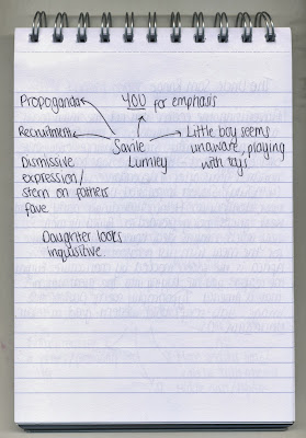
We discussed in small groups our immediate impressions of both images, what thoughts sprung to our mind immediately and what we had to interpret from what we could make out. By doing this in groups we were able to compare ideas and see other opinions that we wouldn't necessarily have considered ourselves allowing us to realise different perspectives and analysis's. Writing down everything as a comparison and in spider diagrams would help me later on when it came to writing my essay as I have to work from an organised structure.


What are the similarities and differences between Schmacher and Ettlinger's 'The Uncle Sam Range' and Saville Lumley's recruitment photo?  

Saville Lumley

Schmacher and Ettlinger

Created in 1876, The Uncle Sam Range advertisement was produced by Schumacher and Ettlinger and had a similar purpose to Saville Lumley's poster created in 1915, both were intended to advertise and persuade, they have a similar audience but have very different techniques on promoting.

American pride is the ongoing theme throughout The Uncle Sam Range, this is very obvious from the moment you lay eyes on this poster from the stars and stripes that cover the majority of the walls. The cooker that it is actually promoting seems to be lost within the picture and the only thing being sold to the audience is that of American pride and wealth, the focus is more on the celebrations that are taking place around the dinner table. It is obviously recognisable that this is a celebration of one hundred years since America claimed their independence on the fourth of July, they are now advertising their wealth and accomplishments in what is a fairly boisterous way.
Saville Lumley took a different approach to commercially persuade or inform his audience, his method was to install guilt on those it was aimed, they presumably knew who they were. His main aim was to make those who were not taking part in the war feel shame and a sense of failure, the use of children makes it seem more personal, their innocence is recognised and conveyed well through their behaviour.

The typefaces used in both posters most definitely enforces the theme of each image, The Uncle Sam Range uses a loud, heavy slab serif font that feels domineering and forceful. The gold colour used shows the richness they are aiming to convey and the recognition of the countries pride regarding how independent and well off they are. Lumley has used a more personal script typeface, it makes you hear it in a child's voice especially due to the opening word being 'daddy' and you feel a sense of empathy towards these children in quite a touching manor.

One key similarity between the two images is the audience which they are aiming these forceful posters towards, initially I spotted that they were both aimed towards the male audience of their time. The Uncle Sam Range advertisement was aimed at the wealthier middle or upper class families, the actual cooker would have been very expensive and a luxury for those who could afford it. It also presents to a man the 'ideal' home life as would have been wanted by any man in this period, Uncle Sam himself is clearly head of the house and centre of all the commotion but not seemingly to be doing any work in the kitchen. Saville Lumley also directed his towards men of the middle and upper class, mainly because those lower class people had already been recruited for the war and the aid of more people was required. It is aimed at those who are shying away from taking part and it is obvious to us that these are the middle or upper class due to the surroundings of the gentleman in the image, wearing nice clothes and what seems to be also lavish furniture for that era.

CoP LCA Prospectus Analysis

After seeing the previous years prospectus before taking a look at the 2014/15 one, it made the latter seem as though it had had been considered in a lot more detail and presented in a more conscious way regarding the audience it was delivering to.
Firstly, I think that the front cover has quite a neutral, relaxed feel to it, the colours compliment each other well although I do not understand the reasoning for these colours it makes it seem slightly more enticing. The foiling that has created the silver title on the front cover adds a professional feel about the institution, also demonstrating techniques and facilities available in the University, it catches the light and becomes the focus of the page. However the spaced out, airy feel of the front cover is contrasted by the compact text on the inside, I find it is too small and is quite off putting, it doesn't grab the attention of the reader and comes across as an academic document. I, personally would only flick through this book and scan the text as I feel my attention span to such a lot of information all in one chunk would be cut off fairly short. Throughout the prospectus there are three shorter pages, printed on different stock, the pages don't seem to fit in with the theme of the rest of the pages as the colour is loud and the material feels cheaper. I don't understand why they are shorter, at first I thought when it had been created it had been misplaced and should have been the right size but looking at the others I feel this was deliberate but with no reasoning. Even though I do not like the typeface used for the main articles throughout the prospectus I really like the typeface used for the titles on each page, I like how clear they are, they do feel quite formal but I think as this is an institution some formality should be kept. If I had designed this I think I would have kept them all the same colour though as I feel the colours get a bit confusing. Finally, something that really stood out to me was the images that were used, not necessarily the content of them but how they are arranged on the page, they seem to be floating with no purpose or explanation. I think if they were in a structured format with a small caption beneath them to explain it would seem more reasonable.

Tuesday, 8 October 2013

Five Inspirations

Chris Ware Building Stories

I love the vibrant colour palettes used in these illustrations, they emote a childlike story which is highly contrasted to what is actually portrayed in the theme of his stories. 

ShaoLan Chineasy

This clever design book introduces a simpler way to learn a new language in a way that is also aesthetically pleasing to all. 

Yoni Alter

The bright colours on these prints are what grab my attention the most, they work really well together and as an exhibition on the whole it was very strong. I like the low percentage opacity allowing new colours to be created via the overlapping objects.

Ant Lucia

Using old style advertising to create a brand new poster is something I find really interesting, it puts a whole new light on what we would dismiss as outdated and brings it into a contemporary context.


100/100 Beers (SB Studio)

The 100 beer labels designed by SB studios I find really interesting as a collective. the simple designs work really well as promotion labels on the bottles.