


What are the similarities and differences between Schmacher and Ettlinger's 'The Uncle Sam Range' and Saville Lumley's recruitment photo?

Saville Lumley

Schmacher and Ettlinger
Created in 1876, The Uncle Sam Range advertisement was produced by Schumacher and Ettlinger and had a similar purpose to Saville Lumley's poster created in 1915, both were intended to advertise and persuade, they have a similar audience but have very different techniques on promoting.
American pride is the ongoing theme throughout The Uncle Sam Range, this is very obvious from the moment you lay eyes on this poster from the stars and stripes that cover the majority of the walls. The cooker that it is actually promoting seems to be lost within the picture and the only thing being sold to the audience is that of American pride and wealth, the focus is more on the celebrations that are taking place around the dinner table. It is obviously recognisable that this is a celebration of one hundred years since America claimed their independence on the fourth of July, they are now advertising their wealth and accomplishments in what is a fairly boisterous way.
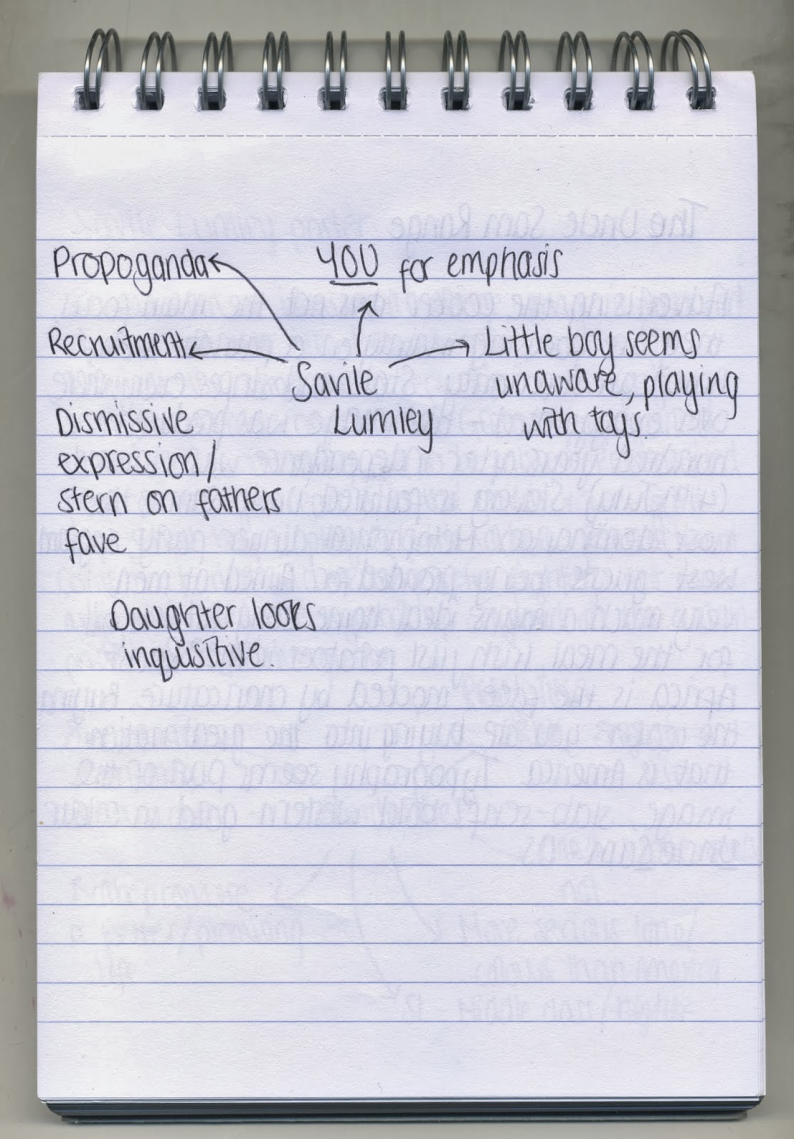
Saville Lumley took a different approach to commercially persuade or inform his audience, his method was to install guilt on those it was aimed, they presumably knew who they were. His main aim was to make those who were not taking part in the war feel shame and a sense of failure, the use of children makes it seem more personal, their innocence is recognised and conveyed well through their behaviour.
The typefaces used in both posters most definitely enforces the theme of each image, The Uncle Sam Range uses a loud, heavy slab serif font that feels domineering and forceful. The gold colour used shows the richness they are aiming to convey and the recognition of the countries pride regarding how independent and well off they are. Lumley has used a more personal script typeface, it makes you hear it in a child's voice especially due to the opening word being 'daddy' and you feel a sense of empathy towards these children in quite a touching manor.
One key similarity between the two images is the audience which they are aiming these forceful posters towards, initially I spotted that they were both aimed towards the male audience of their time. The Uncle Sam Range advertisement was aimed at the wealthier middle or upper class families, the actual cooker would have been very expensive and a luxury for those who could afford it. It also presents to a man the 'ideal' home life as would have been wanted by any man in this period, Uncle Sam himself is clearly head of the house and centre of all the commotion but not seemingly to be doing any work in the kitchen. Saville Lumley also directed his towards men of the middle and upper class, mainly because those lower class people had already been recruited for the war and the aid of more people was required. It is aimed at those who are shying away from taking part and it is obvious to us that these are the middle or upper class due to the surroundings of the gentleman in the image, wearing nice clothes and what seems to be also lavish furniture for that era.
No comments:
Post a Comment